
🎨 Cómo elegir colores y tipografías en UX/UI 🔠✨
Elegir colores y tipografías en diseño UX/UI no es solo una cuestión estética. ¡Puede hacer que tu diseño sea intuitivo, accesible y memorable! 🚀
Si alguna vez te has preguntado:
🤔 ¿Cómo combinar colores sin que duelan los ojos?
🤔 ¿Qué tipografía usar para que el texto sea fácil de leer?
¡Sigue leyendo y descúbrelo! 👇
🎨 1. Colores: La clave de una experiencia visual efectiva
Los colores influyen en la percepción y en las emociones. 🌈💡
🔹 Psicología del color: Cada color transmite sensaciones distintas:
- 🔵 Azul → Confianza, seguridad (Ej: LinkedIn, Facebook).
- 🔴 Rojo → Energía, urgencia (Ej: YouTube, Netflix).
- 🟢 Verde → Naturaleza, crecimiento (Ej: Spotify, WhatsApp).
- 🟠 Naranja → Creatividad, acción (Ej: Figma, SoundCloud).
🔹 Reglas básicas de combinación:
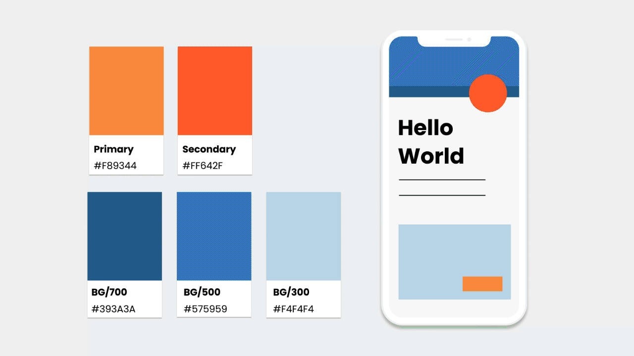
✅ Usa la regla del 60-30-10 (60% color principal, 30% secundario, 10% acento).
✅ Utiliza herramientas como Coolors o Adobe Color para crear paletas armoniosas.
📌 Tip UX: Asegúrate de que haya suficiente contraste para que el contenido sea accesible (usa herramientas como WebAIM Contrast Checker).
🔠 2. Tipografías: Cómo elegir la mejor para tu UI
Las tipografías afectan la legibilidad y la jerarquía visual. 🧐
🔹 Tipos de fuentes y cuándo usarlas:
- Sans Serif (sin remates): Modernas y limpias (Ej: Roboto, Montserrat).
- Serif (con remates): Elegantes y tradicionales (Ej: Times New Roman, Playfair Display).
- Display o decorativas: Para títulos llamativos (Ej: Lobster, Bebas Neue).
🔹 Reglas básicas de tipografía:
✅ No uses más de dos tipografías en un diseño.
✅ Mantén una buena jerarquía con tamaños y pesos diferentes.
✅ Elige fuentes accesibles y legibles, especialmente en dispositivos móviles.
📌 Tip UX: Usa Google Fonts o Fontpair para encontrar combinaciones tipográficas efectivas.
🚀 Conclusión: Simplicidad y coherencia son clave
✅ Usa colores con intención y contraste adecuado.
✅ Elige tipografías legibles y combinaciones equilibradas.
✅ Asegúrate de que todo sea accesible y funcional.
💬 ¿Cuál es tu combinación favorita de colores y tipografías? ¡Compártela en los comentarios! 👇
🎨 How to Choose Colors and Typography in UX/UI 🔠✨
Choosing colors and fonts in UX/UI design is not just about aesthetics. It can make your design intuitive, accessible, and memorable! 🚀
Have you ever wondered:
🤔 How to mix colors without hurting the eyes?
🤔 Which font is best for readability?
Keep reading and find out! 👇
🎨 1. Colors: The Key to an Effective Visual Experience
Colors influence perception and emotions. 🌈💡
🔹 Color psychology: Each color evokes different feelings:
- 🔵 Blue → Trust, security (e.g., LinkedIn, Facebook).
- 🔴 Red → Energy, urgency (e.g., YouTube, Netflix).
- 🟢 Green → Nature, growth (e.g., Spotify, WhatsApp).
- 🟠 Orange → Creativity, action (e.g., Figma, SoundCloud).
🔹 Basic color rules:
✅ Use the 60-30-10 rule (60% primary color, 30% secondary, 10% accent).
✅ Try Coolors or Adobe Color to generate balanced palettes.
📌 UX Tip: Ensure enough contrast for accessibility (use WebAIM Contrast Checker).
🔠 2. Typography: How to Choose the Best One for Your UI
Fonts impact readability and visual hierarchy. 🧐
🔹 Types of fonts and when to use them:
- Sans Serif (no strokes): Modern and clean (e.g., Roboto, Montserrat).
- Serif (with strokes): Elegant and traditional (e.g., Times New Roman, Playfair Display).
- Display or decorative: Great for catchy headlines (e.g., Lobster, Bebas Neue).
🔹 Basic typography rules:
✅ Use no more than two fonts in a design.
✅ Maintain good hierarchy with different sizes and weights.
✅ Choose accessible and readable fonts, especially for mobile devices.
📌 UX Tip: Use Google Fonts or Fontpair for great typography combinations.
🚀 Conclusion: Simplicity and Consistency Are Key
✅ Use colors with intention and proper contrast.
✅ Pick readable fonts and balanced combinations.
✅ Make sure everything is accessible and functional.
💬 What’s your favorite color and typography combination? Share it in the comments! 👇


0 Comentarios